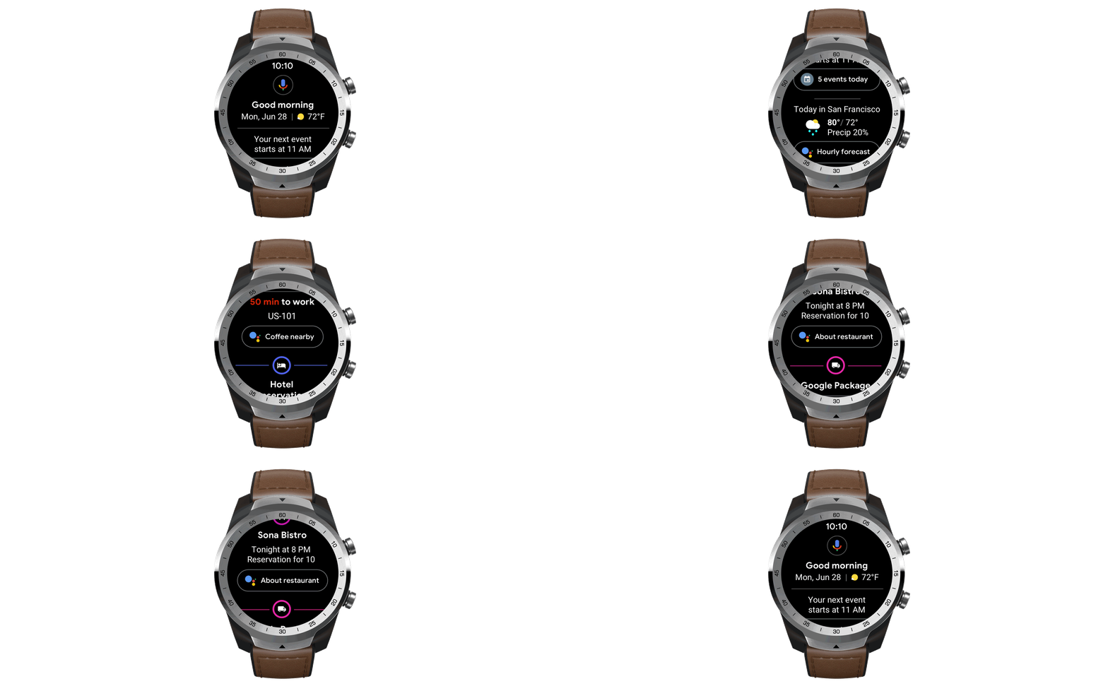
Wear OS, Google’s smartphone operating system that was once called Android Wear, is getting a new look today. Google says the overall idea here is to give you quicker access to information and more proactive help. In line with the Google Fit redesign, Wear OS now also provides you with the same kind of health coaching as the Android app.
In practice, this means you can now swipe through multiple notifications at once, for example. Previously, you had to go from one notifications card to the next, which sound minor but was indeed a bit of a hassle. Like before, you bring up the new notifications feed by swiping up. If you want to reply or take any other action, you tap the notification to bring up those options.

Wear OS is also getting a bit of a Google Now replacement. Simply swipe right and the Google Assistant will bring up the weather, your flight status, hotel notifications or other imminent events. Like in most other Assistant-driven interfaces, Google will also use this area to help you discover other Assistant features like setting timers (though I think everybody knows how to use the Assistant to set a time given that I’m sure that’s 90% of Assistant usage right there).

As for Google Fit, it doesn’t come as a surprise that Wear OS is adapting the same circle design with Hear Points and Move Minutes as the Android app. On a round Wear OS watch, that design actually looks quite well.
While this obviously isn’t a major break from previous versions, we’re definitely talking about quality-of-life improvements here that do make using Wear OS just that little bit easier.

from TechCrunch https://ift.tt/2MVooU9
via IFTTT
Comments
Post a Comment