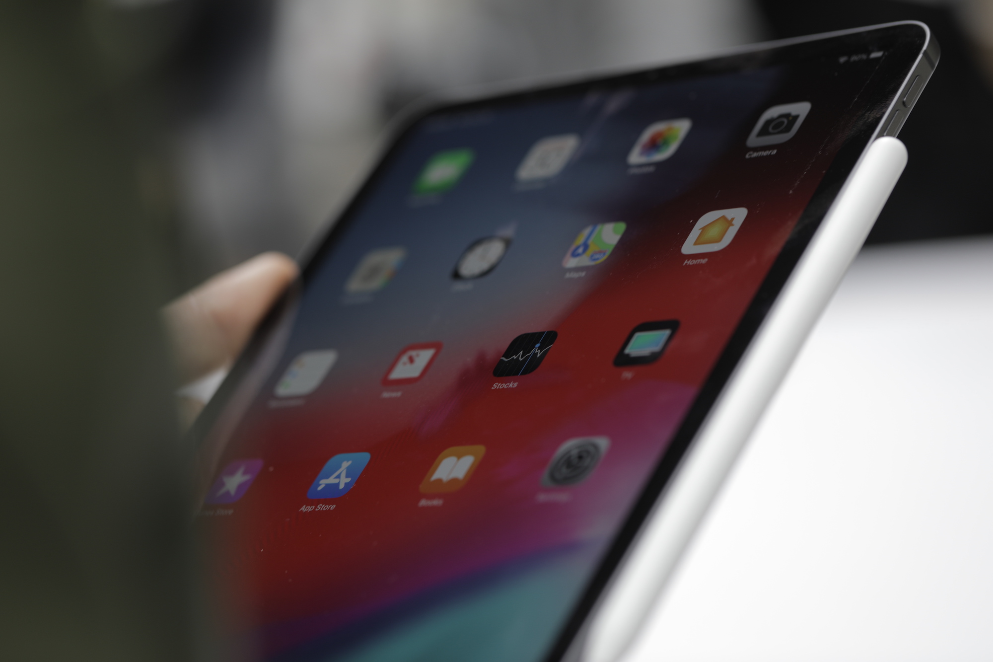
The new Pro marks what is arguably the single largest design change to the iPad line in its eight-and-a-half-year existence. In fact, the new slate is almost unrecognizable as an iPad from the front on.
That’s probably a good thing, of course. The tablet-defining line was long overdue for a rethink. After nearly a decade in existence, it’s time to shake off the cobwebs. And naturally, most of the design upgrades on the new product will ultimately filter down to the rest of the line.
As a starting point, however, Apple took a good, long look at the iPhone for a few insights into how to remove some of that unsightly bezel. Not altogether, of course — after all, the user needs somewhere to put their hands.

Anyone who’s ever held the iPhone X in their hands can tell you that your fingers and the edges of your hands still have the tendency to accidentally come into contact with the screen, which is a perfectly fine way to mess yourself up, mid-game. As such, there’s still the remnants of a black bezel around the edges here.
The loss of the home button feels like a big deal, from a legacy standpoint, at least. The iPad marks the last stand for the familiar design flourish. As someone who’s been carrying around an iPhone XS for some weeks, however, I can attest to the fact that you won’t ultimately miss it.
The key is getting used to the new interactions in iOS, swiping down from the bottom to close an app, for example. The iPad, however, marks the intersection between the iPhone and Mac experience, so there are a lot more options here for interaction, including, notably, the menu bar borrowed from MacOS. The much larger screen real estate, meanwhile (11 and 12.9 inches), means gestures don’t have to do nearly as much heavy lifting as with the iPhone.

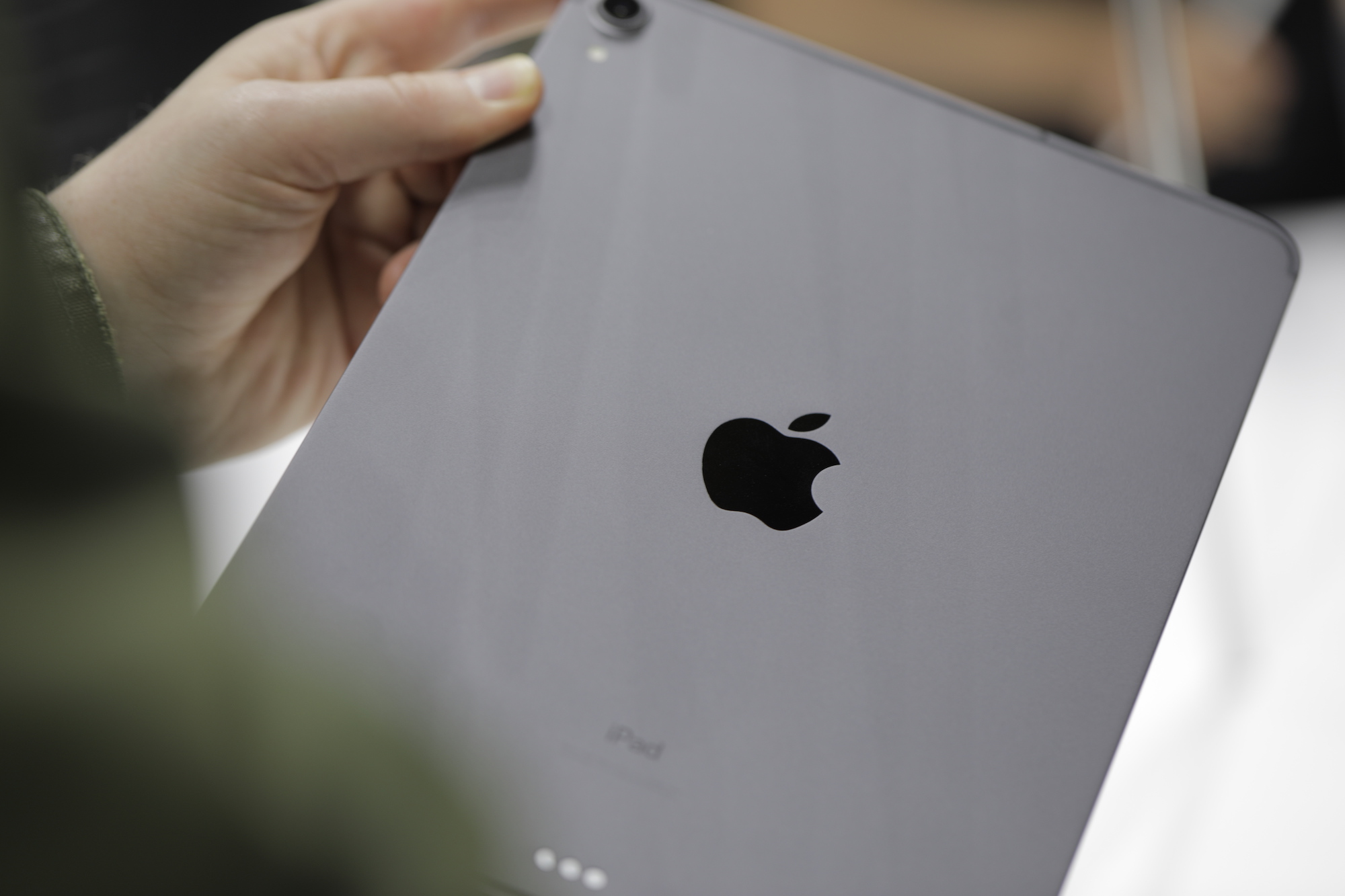
The device is certainly thin, as advertised, leaving the edges — while rounded — feeling a bit sharper than on their predecessor. The rear of the device, with its brushed, space-gray aluminum, meanwhile, brings nothing to mind more than the latest MacBooks, marking an interesting sort of aesthetic consistency that we really haven’t seen at this level between iOS and MacOS devices.
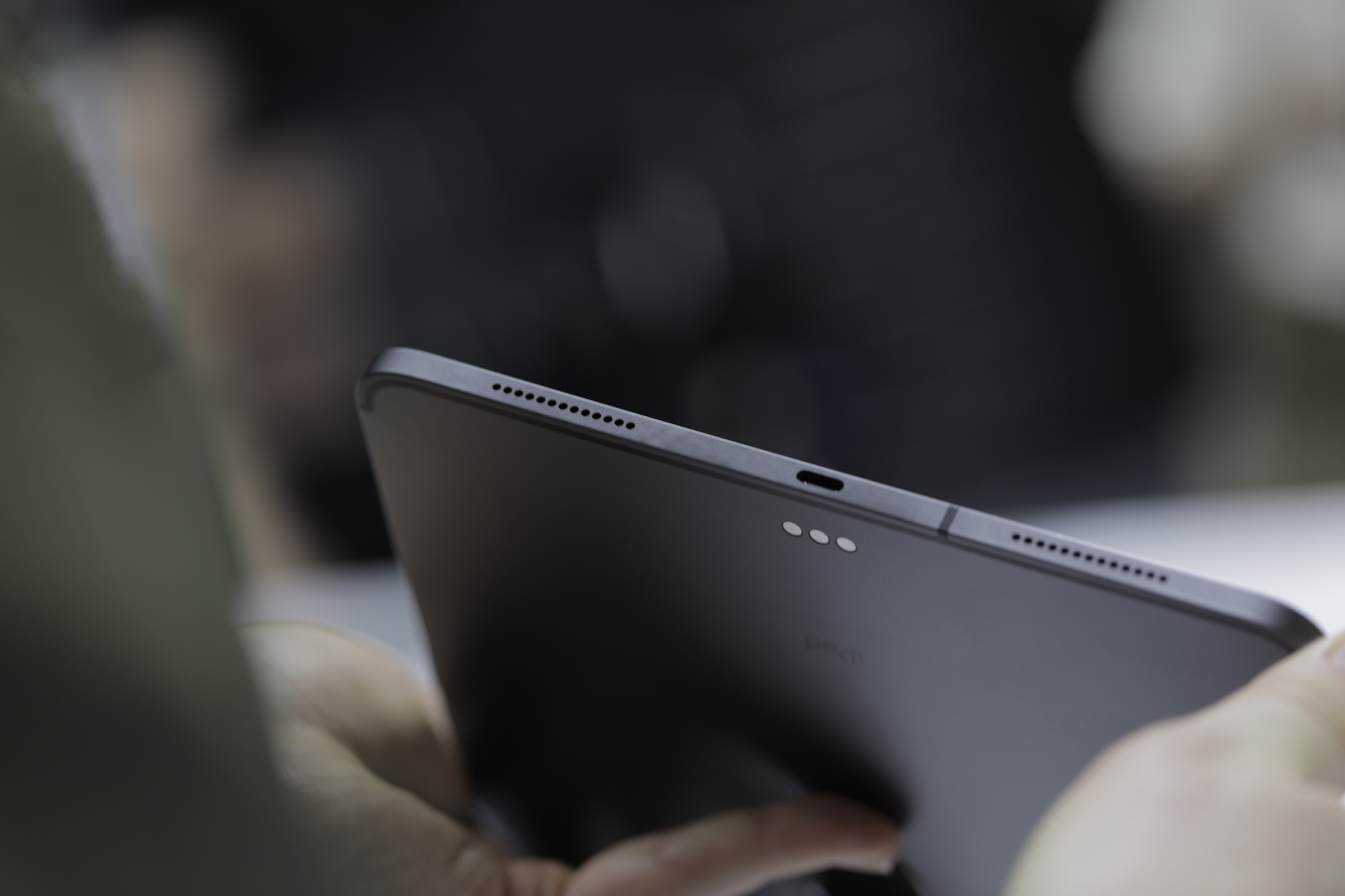
You’ll find the camera at the top of the device — the thinner design does mean it juts out a bit here, so as ever, you’ll probably want to nab a case to keep that bit safe. Along the bottom are a trio of magnetic connectors for the optional keyboard case, which will also help orient the device when it’s time to put it back.

Along the bottom edge, you’ll find the USB-C port. Far and away the most surprising change here, as Apple abandons its longstanding proprietary connector in favor of something far more universal — and, as it happens, something that sends power both ways, making it possible to charge your phone and smaller devices with the iPad itself.
Something Apple didn’t mention during its keynote, however, is the sad, inevitable end of the headphone jack. RIP, little buddy.
On the top edge is a small gray patch. That’s where the new Apple Pencil connects magnetically on its single flat edge (which has the added bonus of making sure it doesn’t roll away when it’s on a table). Apple’s added a nice touch to iOS here, which pops up a charging status for the pencil when it’s connected to the top of the device.
from TechCrunch https://ift.tt/2zeewf3
via IFTTT

Comments
Post a Comment