Investors are spending 24% less time looking at pitch decks in 2022, compared to 2021. On average, you have just under three minutes to convince them to take a meeting with you. In fact, for decks that fail to raise funding, investors give up in just 2 minutes and 13 seconds. That’s not a lot of time to make a first impression, so you’ve got to make it count.
It’s pretty rare that I get to talk to someone who is as big of a pitch deck nerd as I am, but when I was finally able to nerd out with the research lead at DocSend, how could I not? We go deep into what the data tells us about what makes a pitch deck successful, and indicators for what works less well.
The biggest trend change in how investors are looking at pitch decks is that investors are spending a lot less time on slides overall, but where that time is spent is shifting.
“This year, we know that investors are spending less and less time on pitch decks. That’s not necessarily surprising: The number of links to pitch decks sent out has gone up, and the time spent on decks is staying very low,” explains Justin Izzo, research lead for DocSend. “What’s surprising to me is that we know that the product and business model sections of decks are really where investors liked to lean in, especially for companies at the early stages. But investors have almost halved their time spent on these sections at the pre-seed level. Investors are still giving scrutiny to these sections, but they’re doing it so much more quickly than ever before. So founders have to really think deeply about their business, but communicate briefly.”
One of the biggest shifts is that investors spend a lot more time on what DocSend describes as the purpose of a startup slide — the “why are you doing this” part of the story.
“Founders have to really think deeply about their business, but communicate briefly,” laughs Izzo, “I like to call it ‘compelling brevity.’ It isn’t easy to do, mind you, but it is what founders should be striving for.”

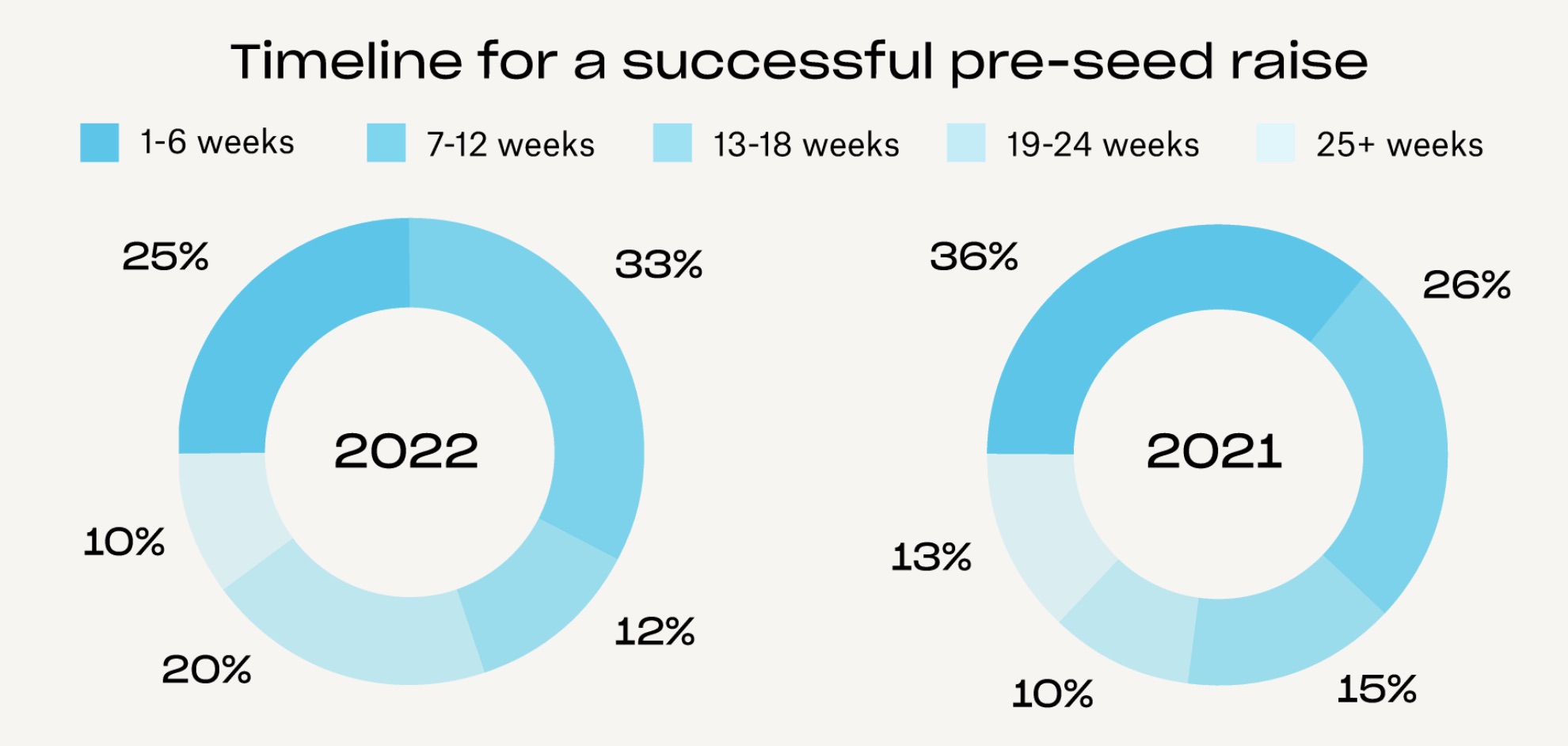
The timeline to fundraising varies. This year, 25% of startups raised in less than six weeks; 58% raised in less than 12 weeks; 70% raised in less than 18 weeks; 90% raised in less than 24 weeks. Last year, the pace was a little bit slower. Graph Credit: DocSend.
The third-longest-viewed section is the Company Purpose section (after the product and business model sections), but Izzo points out that this section is usually only a very small part of the slide deck, often just a line or two of text on slides one or two of the deck.
“Usually it’s one sentence, a pointed and well-balanced statement of what the company is. We usually see that at the very front of the deck, often on the intro slide. What was shocking to me when I first started looking at our latest dataset, was that over the past couple of years, it’s been kind of middling in terms of viewing times,” says Izzo. “This year, it really shot up, and investors tend to be using this section as a kind of gatekeeper. They want to know at a glance whether this company has a reason to exist before even going through the rest of the deck.”
That makes a lot of sense; a business purpose statement is often formulated as “Venmo for Fundraising” or “Transform customer experiences with human-centered AI” or “Issue-tracking SaaS for Physical Product Developers.” Incidentally, those are all real examples from our Pitch Deck Teardown series. The great thing is that investors can use those statements to see if the investment might potentially be a good fit with their investment thesis. If you don’t invest in SaaS, or if you don’t care about fintech, or if you couldn’t give a crap about customer support — that becomes a very quick filter to give a startup team a “no,” without needing to go deep on product, team or market size.
“It’s whether founders can communicate a vision and specificity but what their company does, in in a compelling way. Because if you can do that, you know, you’re hooking investors, you’re showing that there is this thesis fit, and then that gets investors ready, you know, primed to read the rest of their story,” says Izzo. “And you know, doing this in a sentence, sentence and a half or something like that, is tricky to do. But we’re seeing it becomes so much more important for early-stage founders.”
Slides in successful versus unsuccessful decks
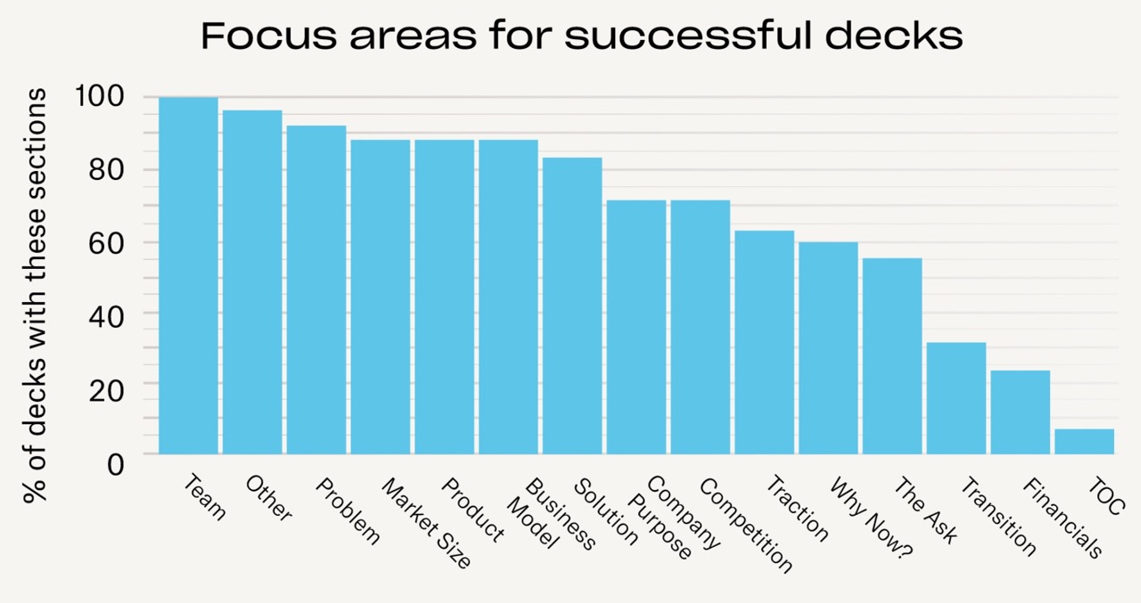
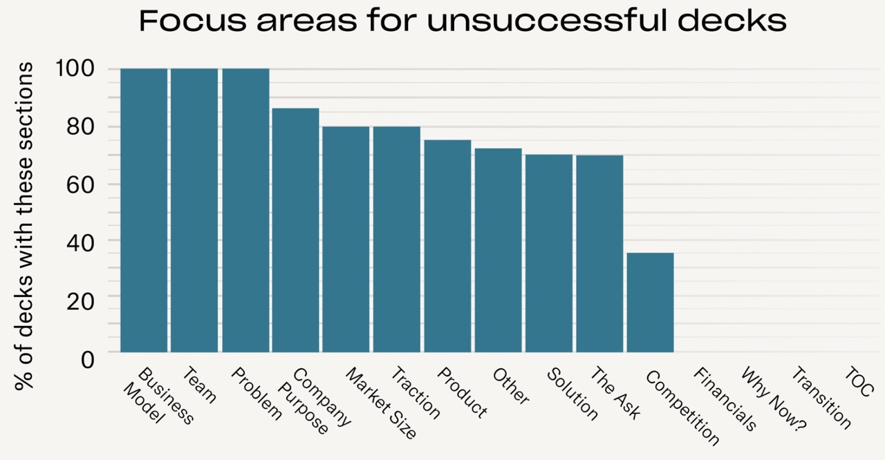
The DocSend team analyzed 320 decks and looked at which slides were present in each. The only slide that was available in 100% of decks, both successful and unsuccessful, was Team, but from there, things start varying a bit.

Successful Decks. Graph Credit: DocSend.
The most interesting difference between successful and unsuccessful decks is the slides that are missing; I was surprised that only about a quarter of startup decks had financials (trust me on this one, you really need an operating plan), but I was unsurprised that none of the failed decks had financials.

Slides in unsuccessful decks. Graph Credit: DocSend.
The other big difference is competition slides; all decks should have an overview covering the competitive landscape.
“The first thing that’s missing is often a competition slide. Founders often don’t think to include it, or when they do, they are using it as a not-so-subtle indicator that there is no competition,” laughs Izzo. “I always tell them to include some kind of analysis of other players in the field, however you define that field.”
DocSend’s team created a fundraising playbook of sorts, and a “state of the union” report for fundraising, comparing the shifts from 2021 to 2022, which makes for a fascinating in-depth read to inform how you’re looking at your fundraising process.
Looking at 320 pitch decks, here’s what science tells us works best by Haje Jan Kamps originally published on TechCrunch
source https://techcrunch.com/2022/09/22/science-of-pitch-decks/
Comments
Post a Comment