Apple’s a hard company to like these days. Their glory days behind them, they have relentlessly pursued a misguided concept of optimization that has alienated their user base and compromised their products. A MacBook SE would go a long way toward smoothing the wake they’ve left behind them.
I was excited that this would be a possibility years ago when the iPhone SE came out. “Here,” I thought, “is a company that has come to recognize the value of its legacy products.”
Although the (old) SE is indeed the best phone Apple has ever made, it’s clear now that it was little more than a way to squeeze a bit more money out of some leftover components. (The new SE seems to serve the new purpose, but I’ve embraced it nevertheless as the old model is increasingly left behind in design decisions.)
That one of its most popular products was an accident should come as no surprise, since Apple doesn’t seem to know or care what its customers want. The last few years have seen it either copying its competitors or compromising usability to skim an extra millimeter or two off devices’ thickness.
The philosophy of telling people what they should want is a longstanding one at Apple, but one that only works if you have someone who knows those people better than they know themselves. Apple seems to no longer have anyone like that, and so they have continued, like a car with no driver and no destination, to mindlessly chase the horizon.
Of course they’re not the only company doing so. Get big enough and cruise control is the safest option. You can go a long way without touching the wheel. But those of us along for the ride may eventually pipe up.
So here’s me piping up: Apple, I’d really love a MacBook SE. And I think a couple million others would, too.
The iPhone SE appealed to the surprisingly (to Apple) large group of people who disliked the direction iPhone design was headed. They disliked the new larger size, the shift away from TouchID and towards a creepy new authentication technique, the notch, the fragility, the lack of a headphone jack that made their device backwards-compatible out of the box with decades of hardware and software.
A MacBook SE would, in a similar way, appeal to the people who dislike the direction notebook design has progressed. They dislike the uncomfortable, difficult to service keyboard, the removal of the beloved and practical MagSafe, the decision to commit entirely to USB-C ports, the tacky and underutilized Touch Bar.
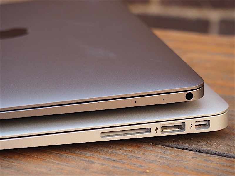
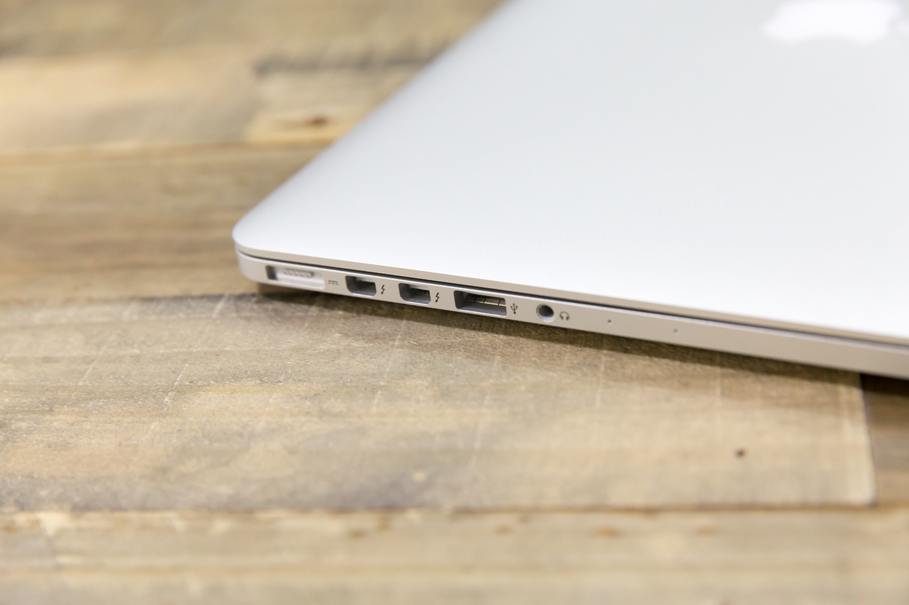
These are people who know what they want and have no option to purchase it from a company that used to provide it. There’s a good trade in 2015-era MacBook Pros (pictured above) and Airs because they were the best notebooks Apple ever made.
To be clear, here’s what I imagine an SE would be: a 13-inch notebook with a MagSafe power connection, USB-C ports and a headphone jack on one side, plus one old-school USB-A, HDMI out, and an SD card reader on the other. Oh, and though I suppose it goes without saying, let’s just be clear: The old keyboard, please.
Obviously it’s a bit presumptuous of me to tell one of the world’s largest and most successful companies that they’re doing it wrong and I’ve got the answer. But I don’t mean to say they should abandon all forward momentum and experimentation. I just want them to throw a bone to those of us who don’t want to be their guinea pigs.
And yes, I hear you all out there — get a Pinebook! A ThinkPad! And so on. Listen, I’m not some kind of Mac-only elitist, especially since years ago their products stopped being worth the premium one always paid for them — and that premium has only increased. I build my own Windows PCs and like it. I just happen to prefer the synergy of Apple’s hardware and software in the notebook form factor. And it’s not just the aesthetic, though Windows is certainly ugly.
That’s why it’s so disappointing to me that Apple seems to have forgotten the reasons its laptops became legendary. Because those same reasons were impediments to Apple’s misguided idea of what it might call elegance. Thinness and “simplicity” at all costs — even when the thinness is imperceptible and the simplicity is strictly on the side of the computer itself, not in how the user interacts with it.
Every owner of an “elegant” new Mac notebook I’ve met — and that’s most of my colleagues at TechCrunch — has to carry around a menagerie of dongles, or borrow them, in order to work effectively across generations and industries. Perhaps a USB-A port looks ugly next to a USB-C one, or the MagSafe connector disrupts the symmetry of the device, but it can’t be worse than the tentacular disaster I see whenever anyone has to do anything on a new Mac laptop but type.
It’s as if Apple made pocket knives, and transitioned over the years from making a Swiss Army knife to a folding knife to a ceramic fixed-blade. Yes, the latter is simpler, more elegant in a certain way. But it sure isn’t any help when you need to open a can or bottle of wine.
Funnily enough, I made the opposite complaint 7 years ago when I felt mobile phones were becoming overstuffed with features. Keep it simple, stupid!
But in a way it was the same problem, just a mirror image. In that case I felt that increasingly bloated Android phones had gone from doing a few things well to doing many things poorly — things no one asked them to do. The real problem isn’t simply too much or too little, but not having the option to choose how much or how little for oneself.
I’m disappointed with Apple because the approach that made their laptops attractive to me in the first place has gone by the wayside. Perhaps that’s just a difference in philosophy, but I feel confident I’m not some kind of extreme outlier. As Apple found when it launched the iPhone SE that there were millions of people who wanted what had come before, I think they will likewise find it so with a MacBook SE. Sure, it’ll eat into the sales of the newer, more “elegant” devices, but it’ll open and maintain a market of people who have held off buying a new device for years because they, like me, have been waiting for Apple to do right by them again.
So please, Apple, grant my wish. Oh, and if you want to guarantee a few extra sales, let me offer one last tip: rainbow logo.
from TechCrunch https://ift.tt/3aNGjW5
via IFTTT


No comments:
Post a Comment