YouTube’s comments section has a bad reputation. It’s even been called “the worst on the internet,” and a reflection of YouTube’s overall toxic culture where creators are rewarded for outrageous behavior — whether that’s tormenting and exploiting their children, filming footage of a suicide victim, promoting dangerous “miracle cures” or sharing conspiracies, to name a few high-profile examples. Now, the company is considering a design change that hides the comments by default.
The website XDA Developers first spotted the test on Android devices in India.
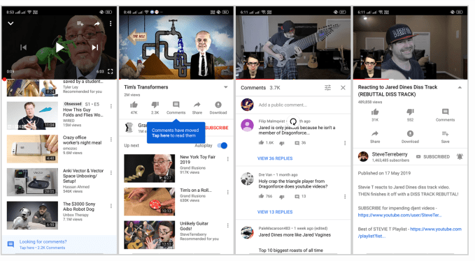
Today, YouTube’s comments don’t have a prominent position on its mobile app. On both iOS and Android devices, the YouTube video itself appears at the top of the screen, followed by engagement buttons for sharing, liking, disliking, downloading and saving the video. Below that are recommendations from YouTube’s algorithm in a section titled “Up Next.” If you actually want to visit the comments, you have to scroll all the way to the bottom of the page.
In the test, the comments have been removed from this bottom section of the page entirely.
Instead, they’ve been relocated to a new section that users can only view after clicking a button.

The new Comments button is found between the Thumbs Down and Share buttons, right below the video.
It’s unclear if this change will reduce or increase user engagement with comments, or if engagement will remain flat — something that YouTube likely wants to find out, too.
On the one hand, comments are hidden unless the user manually taps on the button to reveal them — users won’t happen upon them by scrolling down. On the other hand, putting the comments button behind a click at top of the page instead of forcing users to scroll could make them easier to access.
As XDA Developers reports, when you’ve loaded up this new Comments section, you can pull to refresh the page to see the newly-added comments appear. To exit, you tap the “X” button at the top of the window to close the section.
While it reported the test was underway in Android devices in India, we’ve confirmed it’s also appearing on iOS and is not limited to a particular region. That means it’s something YouTube wants to test on a broader scale, rather than a feature it’s considering for a localized version of its app for Indian users.
The change comes at a time when YouTube’s comments section has been discovered to be more than just the home to bullying, abuse, arguments, and other unhelpful content, but also a tool that was exploited by pedophiles. A ring of pedophiles had communicated through the comments to share videos and timestamps with one another.
YouTube reacted then by disabling comments on videos with kids. More recently, it’s been considering moving kids content to a separate app. (Unfortunately, it will never consider the appropriateness of having built a platform where young children can be put on public display for the whole world to see.)
A YouTube spokesperson confirmed the Comments test, in a statement, but downplayed its importance by referring to it as one of many small experiments the company is running.
“We’re always experimenting with ways to help people more easily find, watch, share and interact with the videos that matter most to them,” the spokesperson told TechCrunch. “We are testing a few different options on how to display comments on the watch page. This is one of many small experiments we run all the time on YouTube, and we’ll consider rolling features out more broadly based on feedback on these experiments.”
from TechCrunch https://tcrn.ch/2IwgXQj
via IFTTT
No comments:
Post a Comment